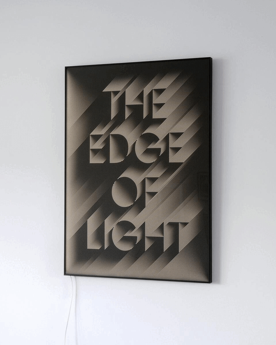
This animation shows a few stages of a transition that is one smooth motion in reality. This does not concern a lenticular, flat screen or video.
THE EDGE OF LIGHT
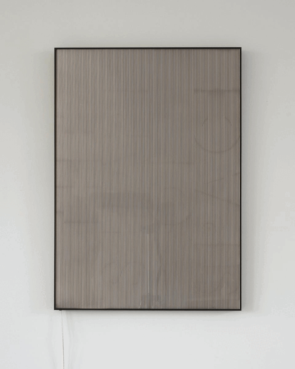
The Spatio-Reactive Reliefs are analog installations in which depth perception and the physical movement of the viewer form an integral part of generating a virtual, kinetic text sculpture. The text responds in real time to the viewer’s movement, causing the sculptural form to continuously shift and transform. ... read more
Technique: UV print, plexiglas, LED, aluminum frame
Edition: 3 signed & numbered + 1 AP
Size: 50 x 70 x 2,5 cm
Available for sale and exhibition opportunities, please inquire for more information.
Click on the image to enlarge it.
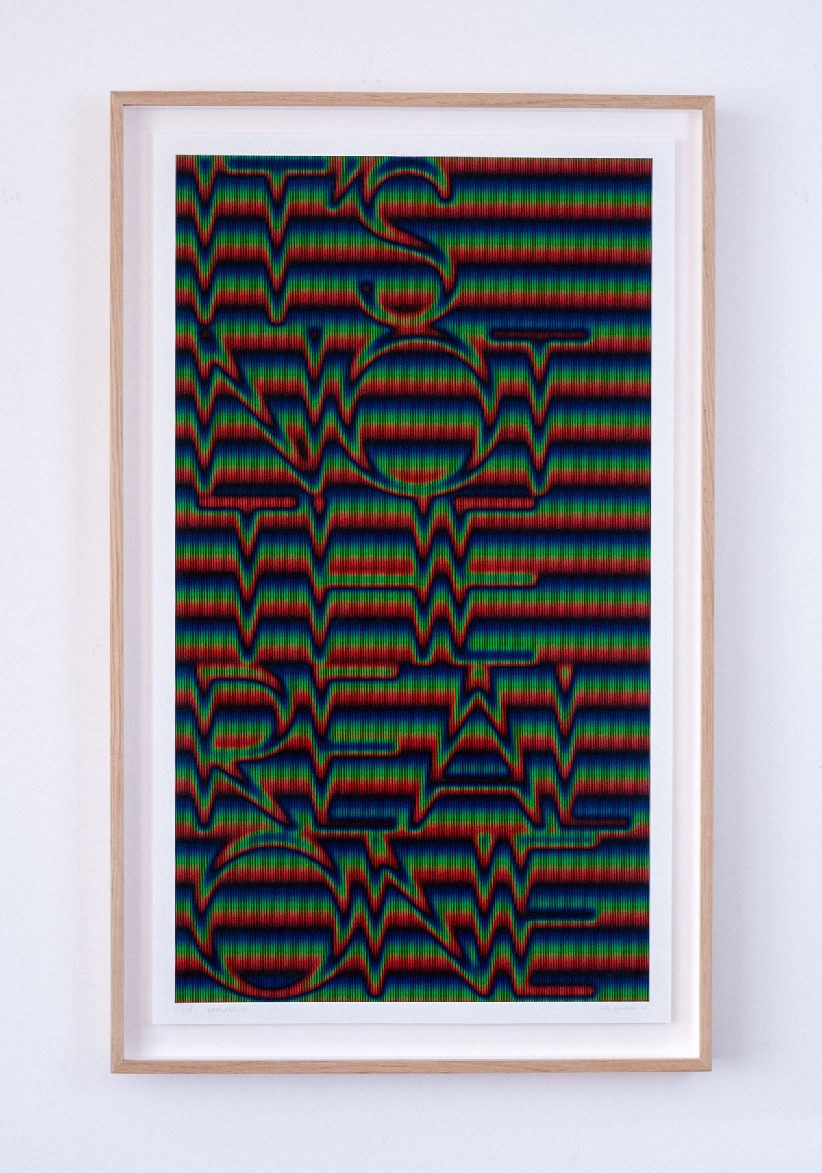
IT'S NOT THE REAL ONE, 2025'
pigment (giclée) print
Hahnemühle Photo Rag
41 x 70 cm (with frame: 47 x 76,5)
edition of 18 unique prints (S&N)
Available for sale and exhibition opportunities, please inquire for more information.
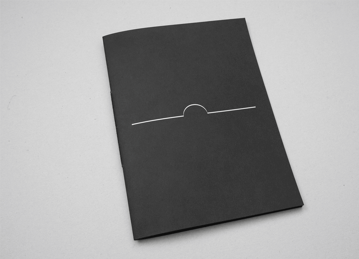
TEXTURE
In this artist’s book, Dijkstra explores the interplay of depth perception, writing and meaning. Its content consists of letterforms, each placed on a separate page, composing the word T-E-X-T-U-R-E. The word originates from a phrase spoken in David Cronenberg’s film eXistenZ (1999): “I’m feeling a little disconnected from my real life. I’m kinda losing touch with the texture of it.”
The book is printed in an edition of 58 copies, plus 4 artist’s proofs. These numbers are derived from the timecode (58:04) in the film — the precise moment when the phrase is spoken.
Technique: digital print, white ink on Fuego Stone black paper
Binding: pamphlet stitch
Dimensions: 20 x 27,5 cm
Pages: 20
Edition: 58 + 4 AP
Price: 27 euros (incl. VAT, excl. shipping)
Please inquire for availibility.
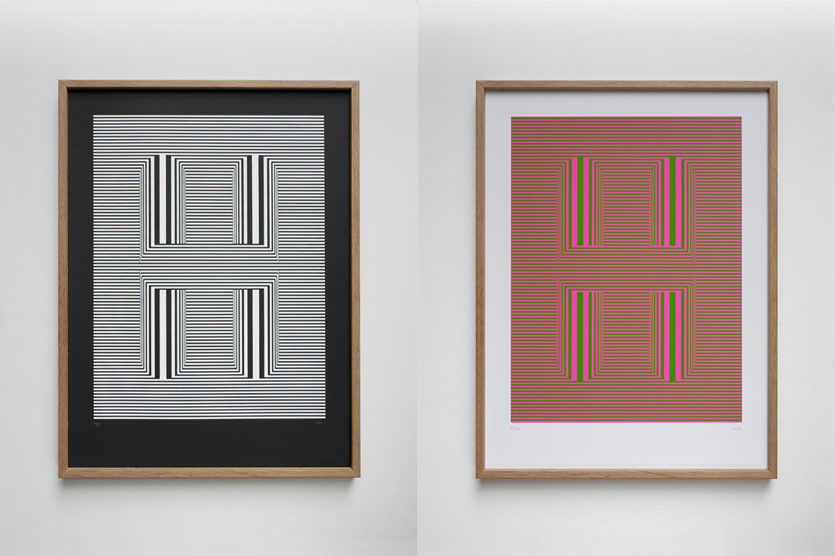
Each letterform print is an exploration of optical phenomena and principles of perception through which it takes shape. These prints represent an unmistakable preliminary study for his current text-related works, including the Spatio-Reactive Reliefs.
H2 (black and white)
screenprint (hand printed by artist)
Curious Skin Negro 380g
witte inkt
30 x 40 cm
edition of 8 (+2 AP) (S&N)
H1 (fluor pink and green)
screenprint (hand printed by artist)
300 grams Munken Polar
30 x 40 cm
edition of 30 (+3 AP) (S&N)
Please inquire for availibility.
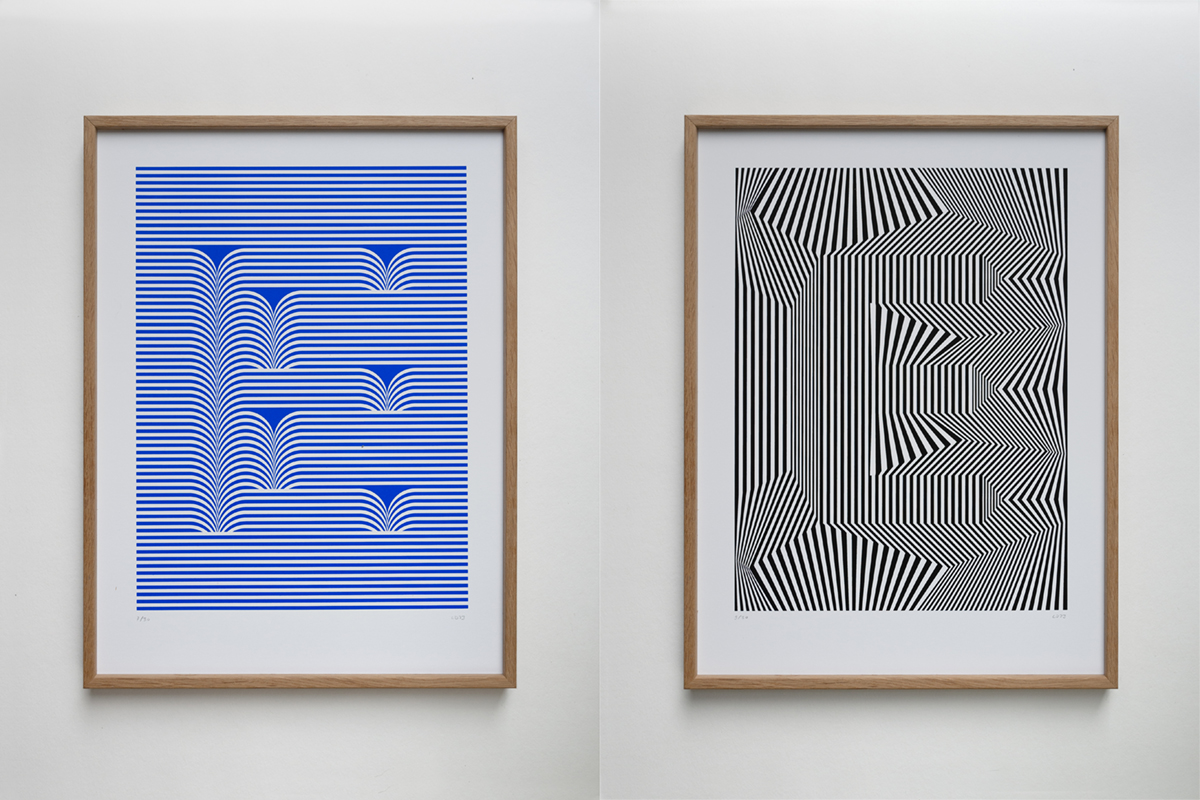
Each letterform print is an exploration of optical phenomena and principles of perception through which it takes shape. These prints represent an unmistakable preliminary study for his current text-related works, including the Spatio-Reactive Reliefs.
EI and EII
screenprint (hand printed by artist)
300 grams Munken Polar
30 x 40 cm
edition of 30 (+3 AP) (S&N)
Please inquire for availibility.
This animation shows a few stages of a transition that is one smooth motion in reality. This does not concern a lenticular, flat screen or video.
THE SHAPE OF SPACE
The Spatio-Reactive Reliefs are analog installations in which depth perception and the physical movement of the viewer form an integral part of generating a virtual, kinetic text sculpture. The text responds in real time to the viewer’s movement, causing the sculptural form to continuously shift and transform. ... read more
Technique: UV print, plexiglas, LED, aluminum frame
Edition: 3 signed & numbered + 1 AP
Size: 50 x 70 x 2,5 cm
Available for sale and exhibition opportunities, please inquire for more information.
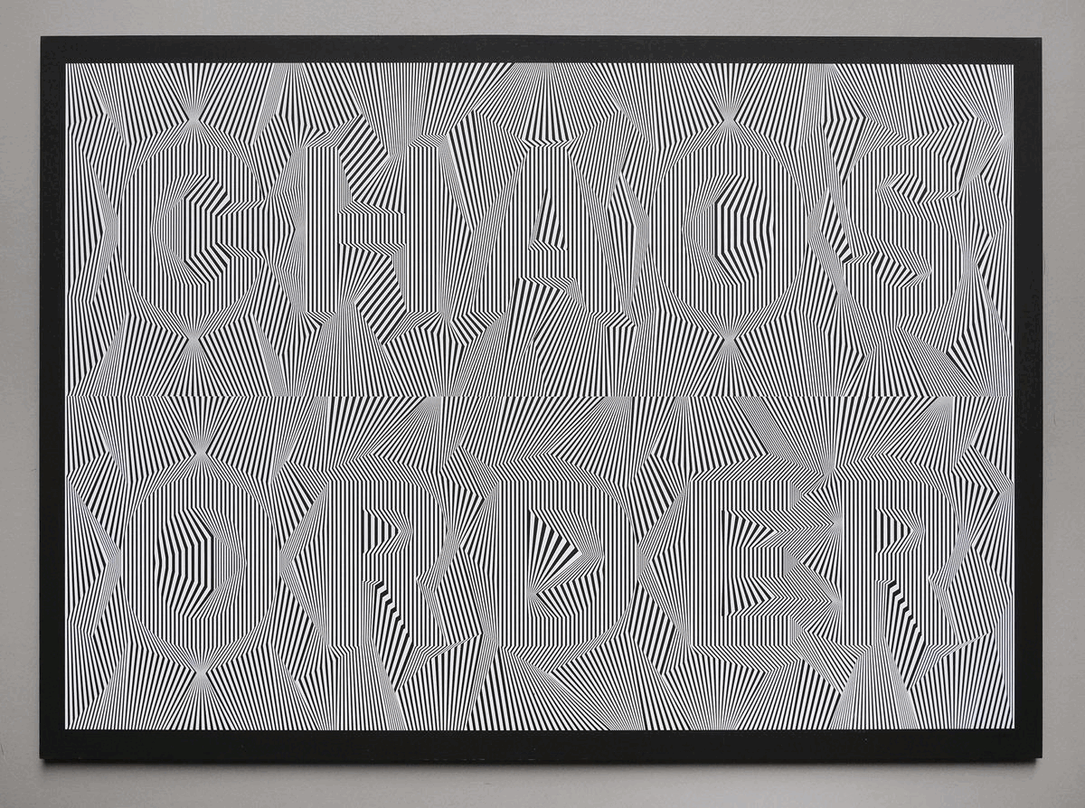
CHAOS IS ORDER (competed in 2021).
CHAOS IS ORDER is a study that avoids the conventional use of contours and contrast to make the letterforms visible. The structure was manipulated from within to allow the letterforms to emerge and stand out. Achieving this effect—without contours or color contrast—required creating a perceptible visual movement (or vibration). This interference occurs within the eye, caused by the rhythm and repetition of the line structures. As a result, certain details along the edges of the letterforms appear to brighten or darken, enhancing the sense of apparent depth on the flat surface through which the letterforms become visible. The words are taken from the quote "chaos is order yet undeciphered".
Technique: screenprint
Size: 70 x 50 cm (27.6 x 19.7 inches)
Color: white ink on Curious Skin Black 380 grams
Edition: 45 signed & numbered
Prices include tax, packaging and shipping.
Payment through PayPal or inquire about alternative options.
Please select your country and click on BUY.
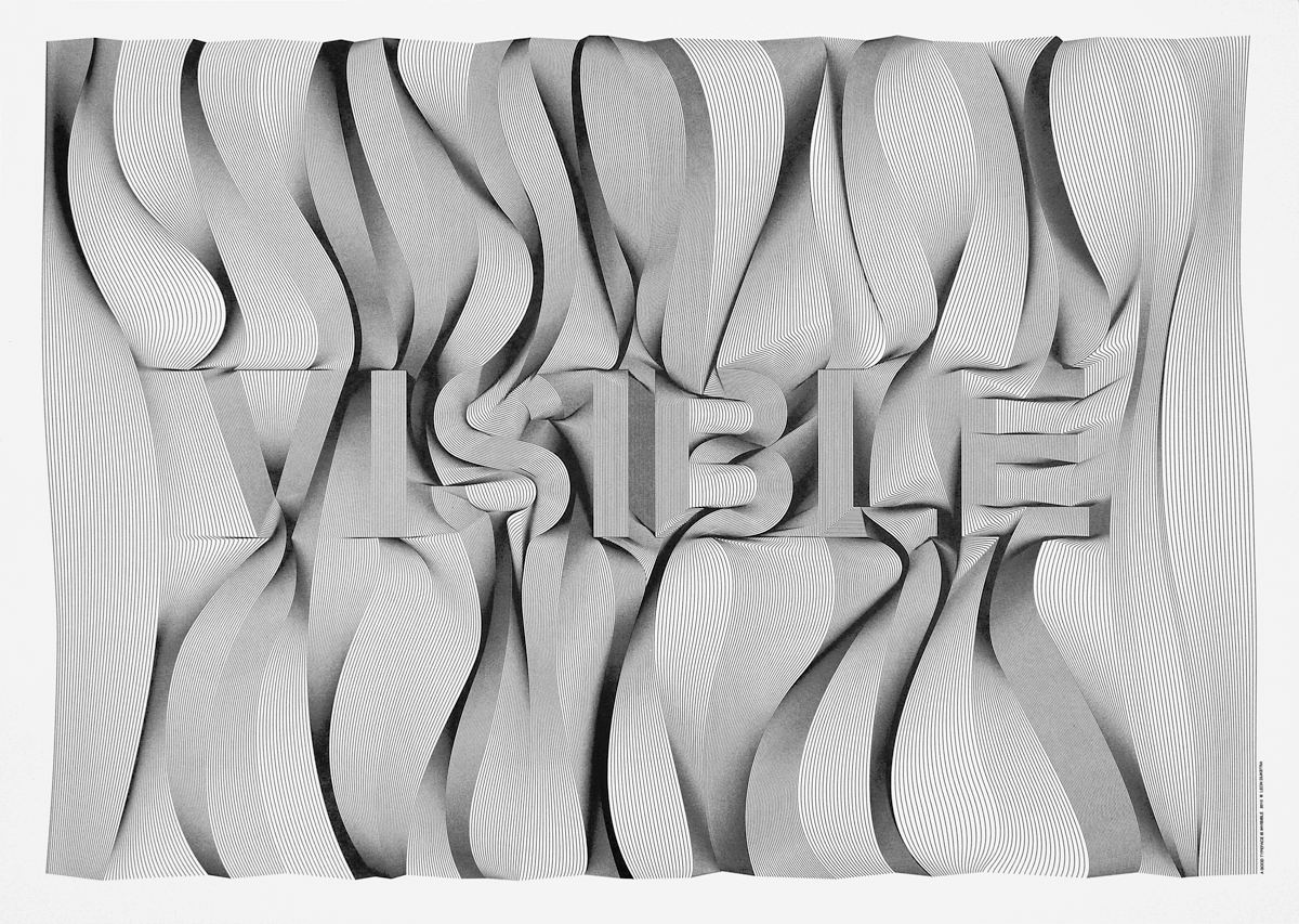
VISIBLE (2010).
VISIBLE is not the result of the experiment, but rather the beginning of it. It didn't focus on the optical or kinetic possibilities of movement, but rather the idea of line structures to become an image and the image to become text.
Technique: screenprint
Size: 70 x 50 cm
Color: black ink on thick art paper
Edition: 50 signed & numbered
Prices include tax, packaging and shipping.
Payment through PayPal or inquire about alternative options.
Please select your country and click on BUY.
ABOUT
Leon Dijkstra conducts research into the relationship between visual perception, writing, and meaning. Through his work, he explores how letters, words, and texts manifest through depth perception, without being rooted in a physical origin. His practice spans various media, including exclusive prints, digital videos, sculptures, paintings, artists’ books, and interactive installations.
Currently, Dijkstra often works with words and phrases drawn from classic sci-fi films. Through his work, these enter into a dialogue with the viewer, exploring themes such as reality, authenticity and identity — themes that resonate in a world where perceptions and experiences are increasingly shaped by digital technology.
His process consists of meticulously constructing and digitally manipulating two-dimensional line structures with the help of a 2D drawing program. With these line structures, he generates a visual sensation of movement and depth on a flat surface, which ultimately leads to the perception of letterforms and words. The visual movement reinforces depth perception. The letterforms are perceived beyond the actual structure from which they are built. This transformation takes place through visual perception within the viewer’s mind — a process Dijkstra describes as ‘mental sculpting’.
The line structures function as a mechanism applicable in both digital and physical environments. Dijkstra creates his work with the idea that it should be applicable in the physical environment, thereby evoking a virtual experience.
Within this method of making, limitations are embraced as a framework for experimentation. The search for the right optical phenomena arising from the line structures is labor-intensive, requiring experiments and countless ‘manual’ interventions, and continuous visual evaluation. For the attentive observer, the hand-made quality is visible. At the same time, the work breathes a digital visual language — one not derived from pixels, but from lines. This blend of analog and digital creates an aesthetic in which visual disruptions, such as glitches and image resolution, play a defining role. While the processing of these line structure images takes place within the viewer’s mind.
SPATIO-REACTIVE RELIEFS
The Spatio-Reactive Reliefs are analog installations in which depth perception and the physical movement of the viewer form an integral part of generating a virtual, kinetic text sculpture. The text responds in real time to the viewer’s movement, causing the sculptural form to continuously shift and transform.
The installation consists of printed, two-dimensional, static line structures that generate the moiré effect. Dijkstra employs this optical phenomenon to produce, on a static flat surface, a visual sensation of depth and motion, which ultimately leads to the perception of spatial text. The text unfolds over time and emerges in a mental space, producing a perceptual experience of depth that extends beyond the material boundaries of the work.
In this way, a contradictory yet vivid spatial viewing experience arises. The viewer knows that what is perceived cannot be a physical reality. Yet the depth perception, responding to their movement, convinces them otherwise. This occurs because the installation engages the same perceptual processes that are vital to experiencing and navigating our physical surroundings. Here, perception is not a passive act but an active engagement in which the boundaries between object and subject blur. The work sets the viewer in motion, who in turn activates the piece. This leads to the question: does the viewer shape the work, or does the work shape the perception of the viewer?
SCREEN PRINTING
Initially, Dijkstra focused mainly on studies of letterforms, which he himself produced in small editions using screen printing. Each letterform print is an exploration of optical phenomena and principles of perception through which it takes shape. These prints represent an unmistakable preliminary study for his current text-related works, including the Spatio-Reactive Reliefs.
The work shown is available for exhibition, please contact me by EMAIL.
Please note that I am available for lectures or to do commission work.
You can follow the research on INSTAGRAM.